Responsive Spacings

Add responsive CSS spacing classes (margin & padding) to any block, container, or area in Concrete CMS.
Click “View Video” in the right sidebar to see the add-on in action.
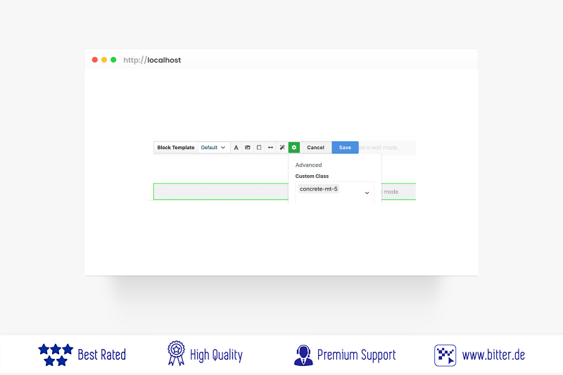
Who hasn't faced the problem? You set padding or margin values for areas or blocks, and while everything looks fine on desktop, those same values are way too large on mobile or tablets. What if there was an add-on that scales your spacing values responsively—automatically adjusting them across all screen sizes?
That’s exactly what this add-on does.
Over the past years, I have developed numerous marketplace add-ons. Click here if you’d like to see more of my extensions.
With Responsive Spacings for Concrete CMS, you can apply utility CSS classes with values up to 100rem in any direction—top, bottom, left, right, or combinations. And best of all: these spacings scale responsively depending on the screen size. Clean, consistent spacing. No more bloated mobile layouts.
Also Check Out
Omni Gallery Elements
Omni Gallery Elements is a developer level Display Widget and Lightbox Overlay extension for Omni Gallery.

Blocks Cloner
Easily copy and paste blocks and custom area styles from one Concrete site to another.
Author

Also Check Out
Omni Gallery Elements
Omni Gallery Elements is a developer level Display Widget and Lightbox Overlay extension for Omni Gallery.
Blocks Cloner
Easily copy and paste blocks and custom area styles from one Concrete site to another.