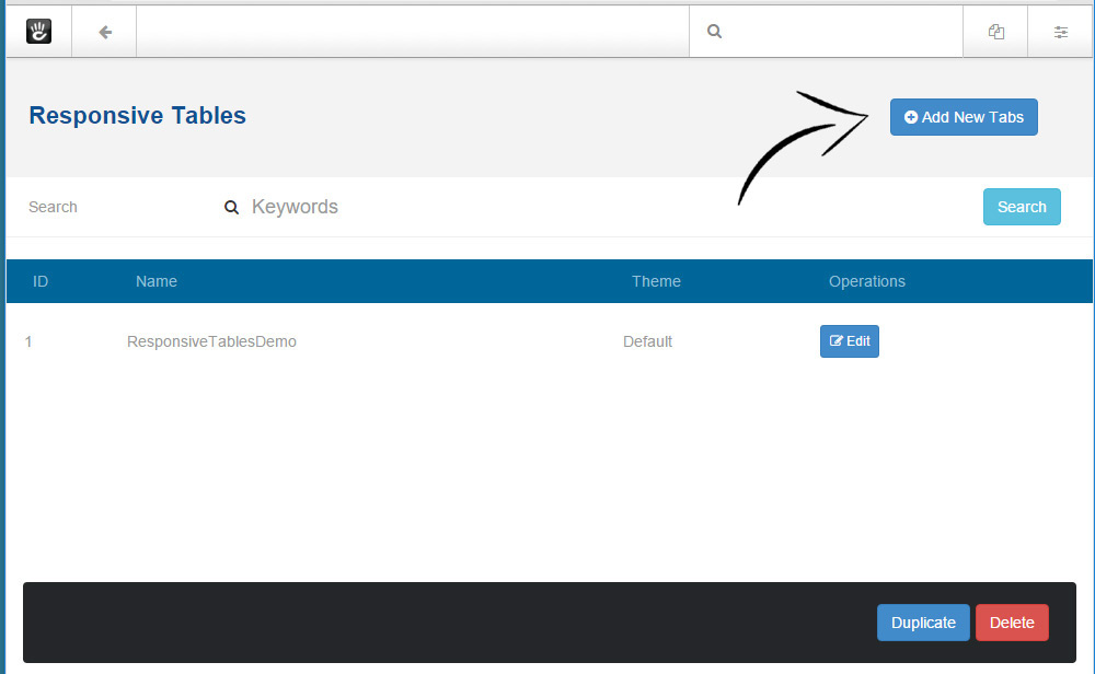
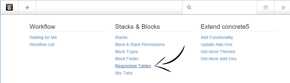
Responsive Tables
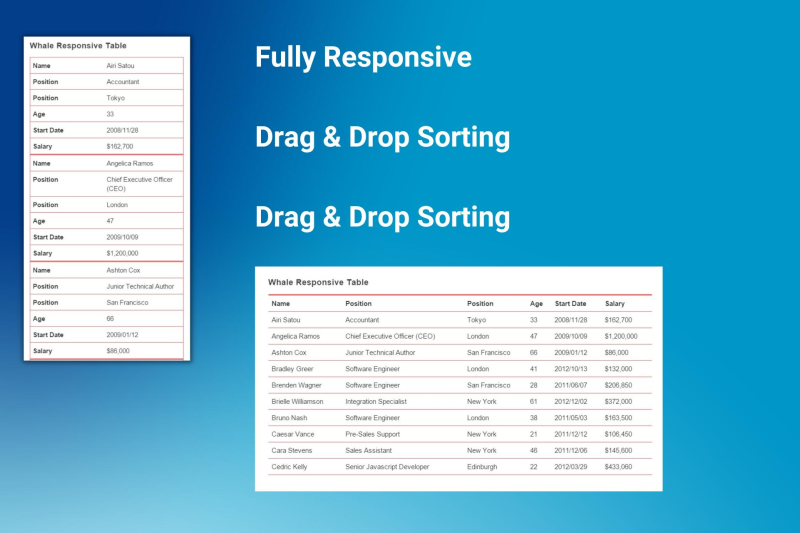

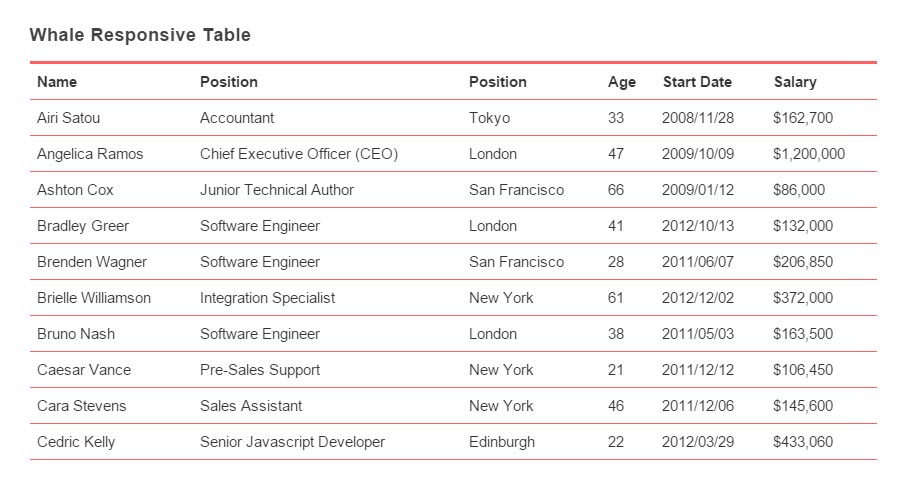
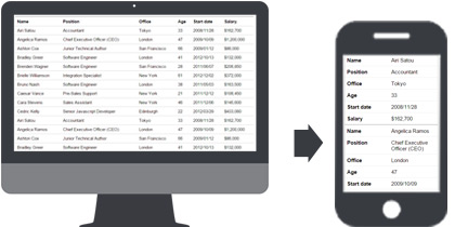
Whale Responsive Tables is a simple table designer that allows you to build fully responsive tables.
Whale Responsive Tables is a streamlined table designer aimed at creating fully responsive tables effortlessly. It's designed to ensure optimal viewing across various devices, particularly on those with smaller screens, providing a tidy list view. This tool is capable of managing multiple tables within a single page without any hitches. Remarkably, its rendering relies entirely on pure CSS, making it efficient and straightforward to integrate.
Features and Options:
- Fully Responsive: Adaptability to any device screen, ensuring optimal readability and interaction.
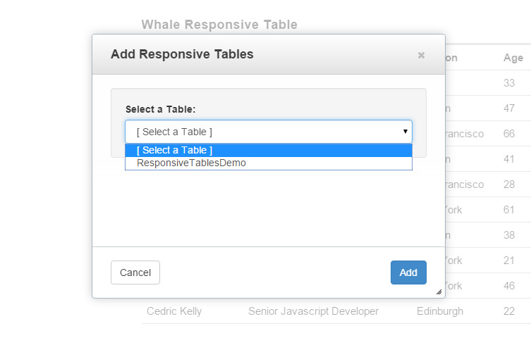
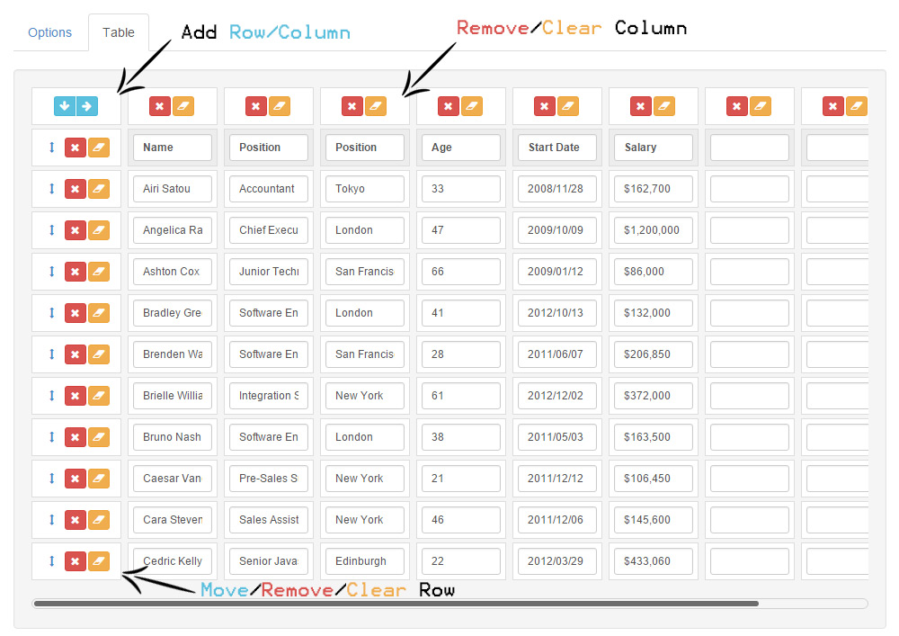
- Dashboard Table Designer: Intuitive interface on the dashboard for easy table creation and modification.
- Drag & Drop Sorting: Simplifies the organization of table rows through a user-friendly drag-and-drop mechanism.
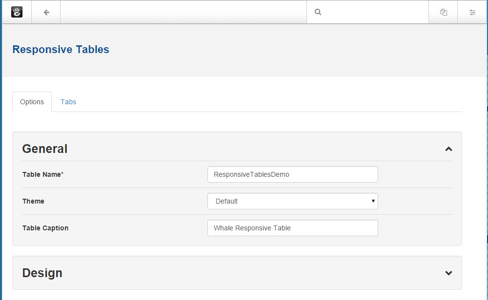
- Table Caption: Allows for the addition of a descriptive caption to each table for better context and accessibility.
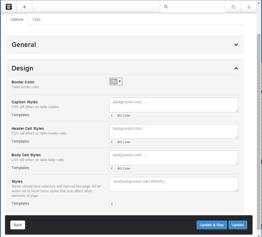
- Color Schema: Customization of border colors to adhere to personal or brand color schemes.
- Editable UI: Provides options to stylize captions, header cells, and body cells directly through the editing interface.
- Caution: Tables are designed to be responsive based on the browser window's size; hence, placing them in very narrow spaces may result in table overflow beyond the intended area.
Also Check Out
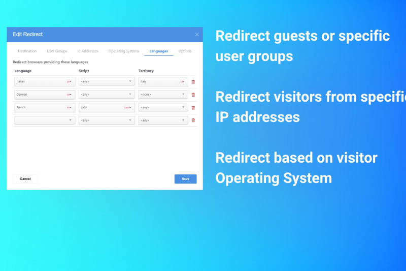
Redirect
This add-on introduces powerful targeted redirection of visitors based on specific criteria.

Author

Also Check Out
Redirect
This add-on introduces powerful targeted redirection of visitors based on specific criteria.