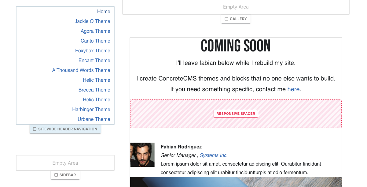
Tallacmans Responsive Spacer

Enhance the responsiveness and layout of websites across various devices
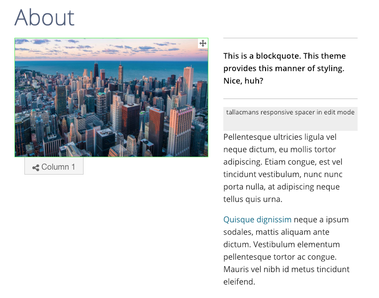
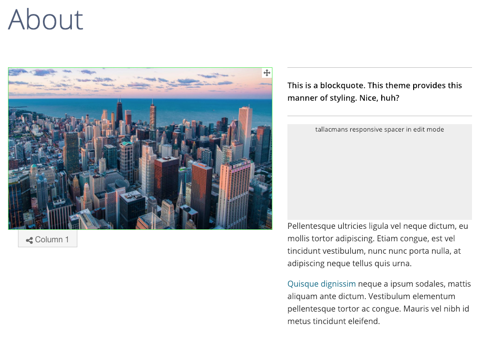
This spacer block is a self-contained unit that seamlessly integrates with any theme or framework, leveraging the breakpoint system from Bootstrap to ensure consistent spacing across different screen sizes. Its functionality is not limited by device labels like "Phone" or "Tablet"; instead, it dynamically adjusts based on the actual pixel width of the viewer's screen, offering a broad compatibility range from modern phones to large monitors.
Features
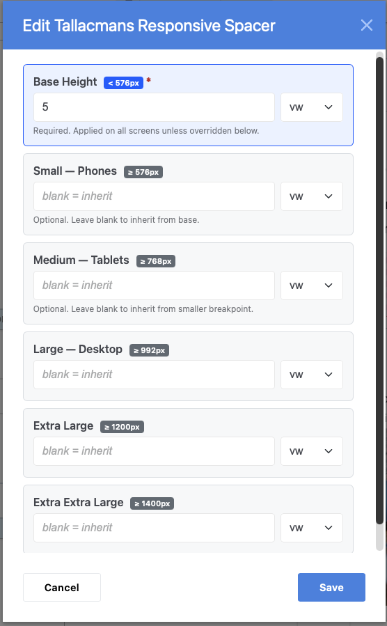
- Adopts 5 Breakpoints from Bootstrap 5: Tailors spacing for screens larger than 0px (all screens), 576px (modern phones in portrait mode), 768px (tablets), 992px (laptops and desktops), and 1200px (large monitors).
- Cascading Settings: Allows for upward cascading of settings. Setting a smaller breakpoint affects all larger screens unless overridden by specific larger breakpoint settings.
- Multiple Measurement Units: Supports three units of measurement for spacing - rems, pixels, and vw (viewport width fractions), providing flexibility in spacing customization.
- Dynamic VW Setting: The viewport width (VW) setting dynamically adjusts the block's height in relation to the screen width, enabling realistic spacing across a wide range of device sizes, from smartphones to huge monitors.
Also Check Out

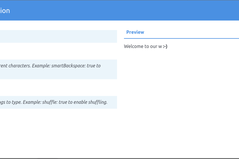
Text animation
A package of add-ons for Concrete CMS that allows you to create typewriter effects on your website.

Author

Also Check Out
Text animation
A package of add-ons for Concrete CMS that allows you to create typewriter effects on your website.